The quick idea
QR code performance is rarely “random.” It’s usually a chain of small, fixable problems:
- physical scan reliability (print + contrast + quiet zone)
- redirect hygiene (no chains, no weird blockers)
- landing speed + message match
- measurement (UTMs + one clear conversion event)
A practical checklist
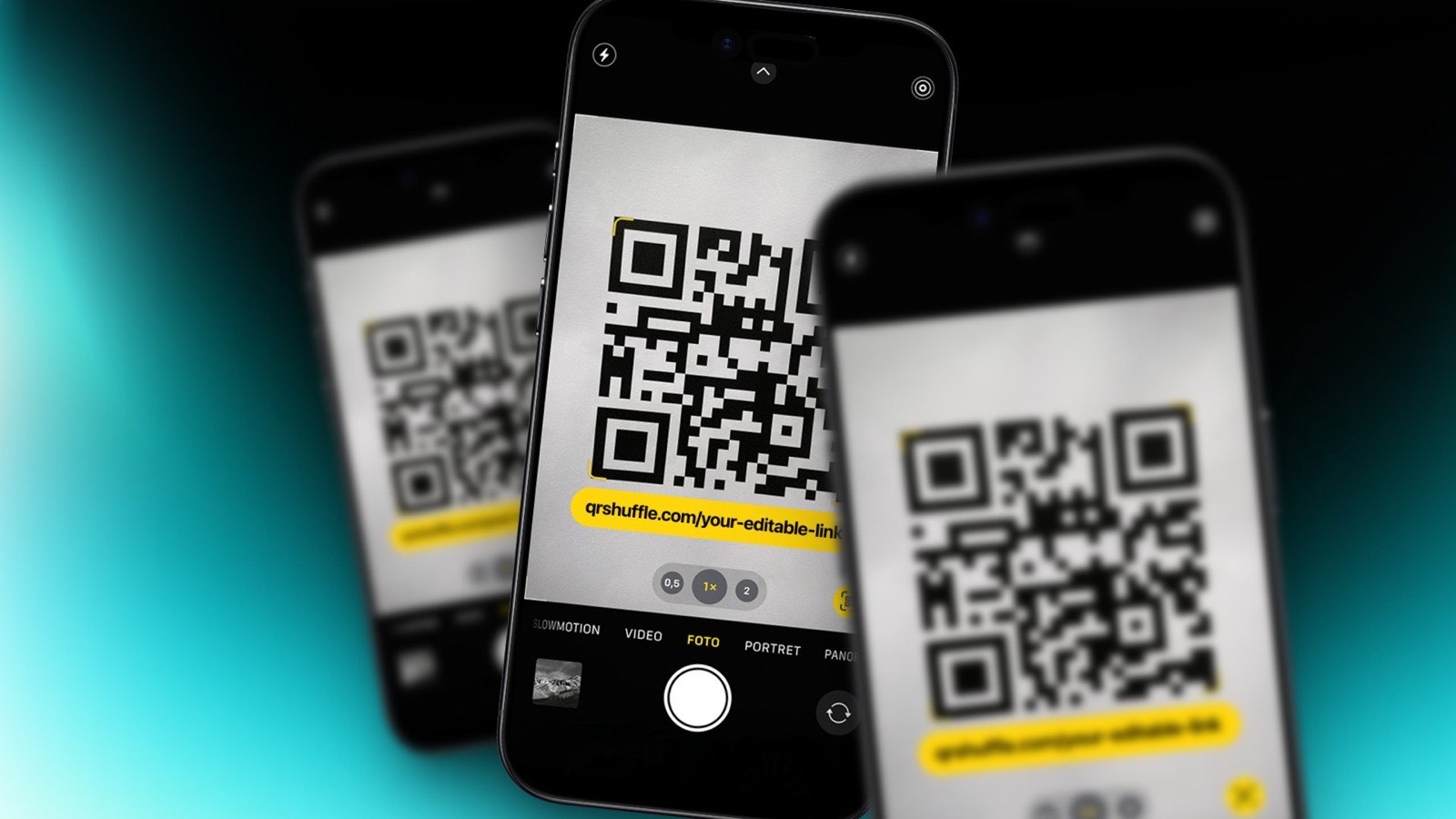
[ ] High contrast (dark on light). [ ] Quiet zone (don’t cram it into a corner). [ ] Short redirect chain (ideally 1).
[ ] Landing page loads fast on 4G. [ ] Clear next action in the first screen. [ ] UTMs on every campaign.
Next reads
- The quiet zone: the boring QR detail that saves campaigns
- QR on packaging: what works in supermarkets
QRShuffle: generate QR codes with editable links (change destinations later). https://qrshuffle.com/signup
Quick checklist
Test on iOS + Android. Use high contrast (dark code on light background). Keep a clear quiet zone.
Avoid long redirect chains. Add UTMs if you care about attribution.
Related reads
Try QRShuffle
If you're printing QR codes for posters, packaging, menus, or events, use editable links so you don't have to reprint.
- Create your first QR: https://qrshuffle.com/signup
- See pricing: https://qrshuffle.com/pricing